Sunday 25 March 2012

All fades to black...


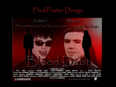
One of the main components in terms of effects that were vital to my trailer was the famous eye replacement effect (black eye effect). It is a feature used to identify a character as part of the vampire side and heighten the moment when they "vamp out" as such like in "Being Human" when they taste blood which results in bearing their fangs and eyes changing black. So it was very important to get this effect correct and accurately done since without it, the project would lack the verisimilitude needed to convincingly display the chosen characters as vampires.

I had thought about using the effect when I initially started planning my project as being a fan of many forms of the vampire medium, I knew already it was a vital and widely used convention of the genre. Whilst planning the project, I asked Sir and consulted forums on-line to see if an effect like this was possible with the programmes we had and it was, but only if After Effects was used. This was were the problems started to arise mainly due to my inability or lack or knowledge with the programme since I had no idea where to even begin with it as it felt daunting to even attempt. The focus shifted to perhaps purchasing black contacts as no computer work needed and would look a lot more natural. However the potential cost for each actor who needed them would be expensive and would only change the iris not the whole eye unlike what is seen in the other media. So I decided to brave it and learn to use After Effects by viewing tutorials on the internet, mainly Video Copilot. (http://www.videocopilot.net/) This site was a monumental help as it showed me the basics like tracking etc. and then more specific examples of effects, more importantly, an actual eye replacement effect.

With the knowledge, I did a test of it by placing a motion track on the eye and creating a matte around the eyeball so it can be replaced with a black texture, and here was the first test:


You can obviously tell the track was off too much by the excessive shaking of the matte when it follows the eye and plus the texture was very plain. In all, while it wasn't too bad for a first go, it was no where near as good as it could be or professionally looking enough to make it look like it was a film trailer. So I went back through and started to practise with motion tracking and looking for better textures, finally resulting in the best examples of Craig's final reveal at the end of the trailer and mine after feeding on Ellen.


This attempt was much better as with a more accurate track, better texture, more well drawn matte around the eye and even a little shine to the eye to make it look more authentic. The added transition from normal state to the vampire like state is also a much needed extra to help sell the effect as it turns black as my eyes open. Not to mention the sting used as well really gives it that supernatural and horrifying effect that this is more horror/supernatural theme and genre.


This one I think is my best effort of doing the black eye effect as they track and matte were done better as there is little shake or white exposed from the original eye. The general filming of it and the texture really suit the moment especially with the line he says, a little clichéd but it suits the purpose of the scene. The sting from my previous eye effect is also used to represent it as another supernatural/reveal moment as the eyes change to black and also signifies that it means a particular scene involving the supernatural characters is about to take place or has already happened in the scene with me.

Saturday 3 March 2012

Final Project - "Blood Debt" The Undying Cut

Blood Debt - The Undying Cut A2 Media Project from James Corker on Vimeo.


Here is the new cut for my "Blood Debt" film trailer with the few tweaks that Sir suggested. I added an extra sting to the moment where Matt kills the girl and his eyes turn black, it really mixed well with the existing tracks and added like a traditional horror type of screeching as the eyes jump to black and as he bites his victim. I also extended the Blood Debt title at the end as admittedly looking back through it, it was quite short so I extended it a second or two and added a little fade as it needed the screen allowing a smoother edit to the next shot and it also had minimal effect on the music track underneath it. I also had another go at fixing some of the audio as that is the weakest point at times. The voice-over by Matt after we see his death I took another take and replaced it whilst boosting the volume and its much more clearer and easily heard compared to the original one. The rest I tried going back and tweaking the volume and trying to eliminate more of the noise but its almost impossible to have clear, crisp audio when using the cameras (hence why I used my Dictaphone to do the voice-overs) so I cleaned it up best I could as couldn't re-dub the whole dialogue as you would be able to tell it was re-dubbed as no atmosphere to the vocals and not the same tone so it would have had a more harmful effect on the film trailer. So I cleaned up what I could, added some low, undertone music at parts to help mop up any distortion left over and hope it works.

*Update* 
Added the sting to Craig's black eye effect moment at the end of the trailer to give it the same sense of horror and the supernatural it does and makes it instantly recognisable as soon as you here the sting you know what to expect. and also added the green title card at the beginning "approving it for all audiences" to make it look like a official trailer. There were a few problems as well with some of the lighting of some shots, mainly the first scene of Craig talking as it had a unnatural high red bloom for some reason even though it rest of the shots filmed weren't like that. So I went back to it, tweaked the colour balance by lowering the red tones and reduced a little of the brightness to remove the sheen while boosting the contrast to compensate and I got it to look a lot more like the previous shots as it was incredible obvious before these tweaks. Another was the shot of the bloody hand, the lighting was off compared to the following shot but it was much easily fixed. Sir suggested desaturating the other flashback scenes as well since it was a little confusing and jarring to try and tell what is the past and present scenes. So whilst I was adding these effects to the two mentioned scenes, the lighting problem was fixed just by the effect and nothing else, the only thing was a lower threshold of the "Leave Colour" effect as red was more predominate in this scene and its a constant factor that is made present throughout  the project as blood being a key element of this genre of film and for the vampires themselves as highlights their blood thirsty but also dependent, addicted and also quite routine nature as their lives revolve around this one element to keep them alive. So I simply lowered the threshold to allow of the red to still be seen and stand out as many of the shots focus in on this blood and not being able to see it would be a waste and ruin the point of these particular scene.

Final Project - "Blood Debt" No glitter in sight...


 Will comment later after sleep...